en

Building a Champions League team, but marketing yourself like a relegation candidate. It’s a paradox we see all too often in the B2B market. Since 1983, Mercurius has been a heavyweight in European inland shipping, backing up a fleet of cutting-edge tech with true, homegrown craftsmanship. But how do you give a giant like that a voice that actually resonates from the shipyard to the quayside? Together with Mercurius, we found that sweet spot between down-to-earth humility and well-deserved pride.
World-class craftsmanship wrapped in a faded captain’s jumpsuit. It’s a stubborn paradox we see all too often in B2B: a stellar family business with over 40 years of heritage, whose product and culture are second to none, yet masked by that classic industry modesty. Online and on the docks, they just weren’t showing their teeth. In a market plagued by a cutthroat shortage of (senior) crew members and where the physical distance between ship and shore makes connection tough, your brand image cannot afford to sabotage recruitment and growth. Together with the Mercurius team, we dove into a branding trajectory to solidify their brand foundation and chart a strategic communication course for the years ahead.
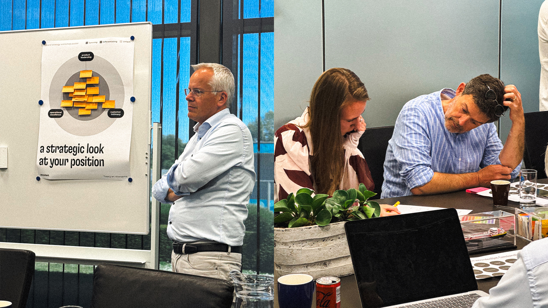
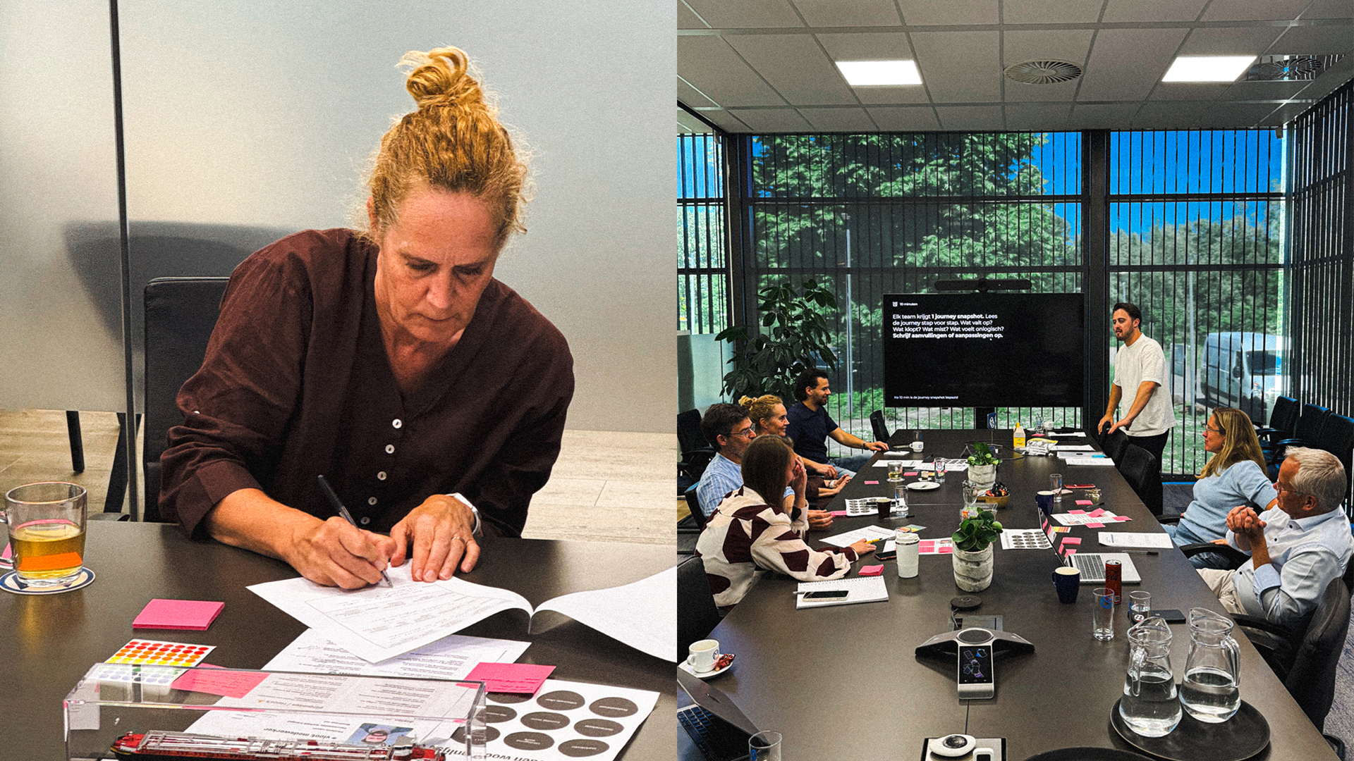
The inland shipping crowd is down-to-earth; they can spot a slick, corporate marketing pitch from a mile away and they hate it. Mercurius needed to steer clear of the usual marketing fluff and start with a deep dive into the actual heartbeat of the sector. Through intensive brand sessions and deep-dive analysis, we uncovered the raw reality. The verdict? Mercurius’ true power lies in the perfect blend of cutting-edge tech and old-school craftsmanship. We found our strategic spark in the fierce camaraderie of sports clubs. Where pride, loyalty, and long-term commitment form the ultimate playbook for success.
Having uncovered the raw reality, we mapped out the strategic positioning and course for the years ahead: building what lasts by navigating on generations of craftsmanship. A positioning built not for show, but for the people on the deck. From now on, that craftsmanship is no longer hidden: it is honored and protected like an older brother. A down-to-earth platform through which Mercurius sends a crystal-clear message to both current and future crew: we see you, you’re on our radar, and you belong.
The inland shipping industry is notoriously critical. If a concept is too polished, they’ll see right through it. That’s why we put it to the ultimate test. Before touching a single pixel of design, we thoroughly vetted the positioning concept through interviews with every single target group. From the crew on the water to the team in the office. Only when we saw the message truly hit home did we know that, together with Mercurius, we were ready for the next step: brand design.
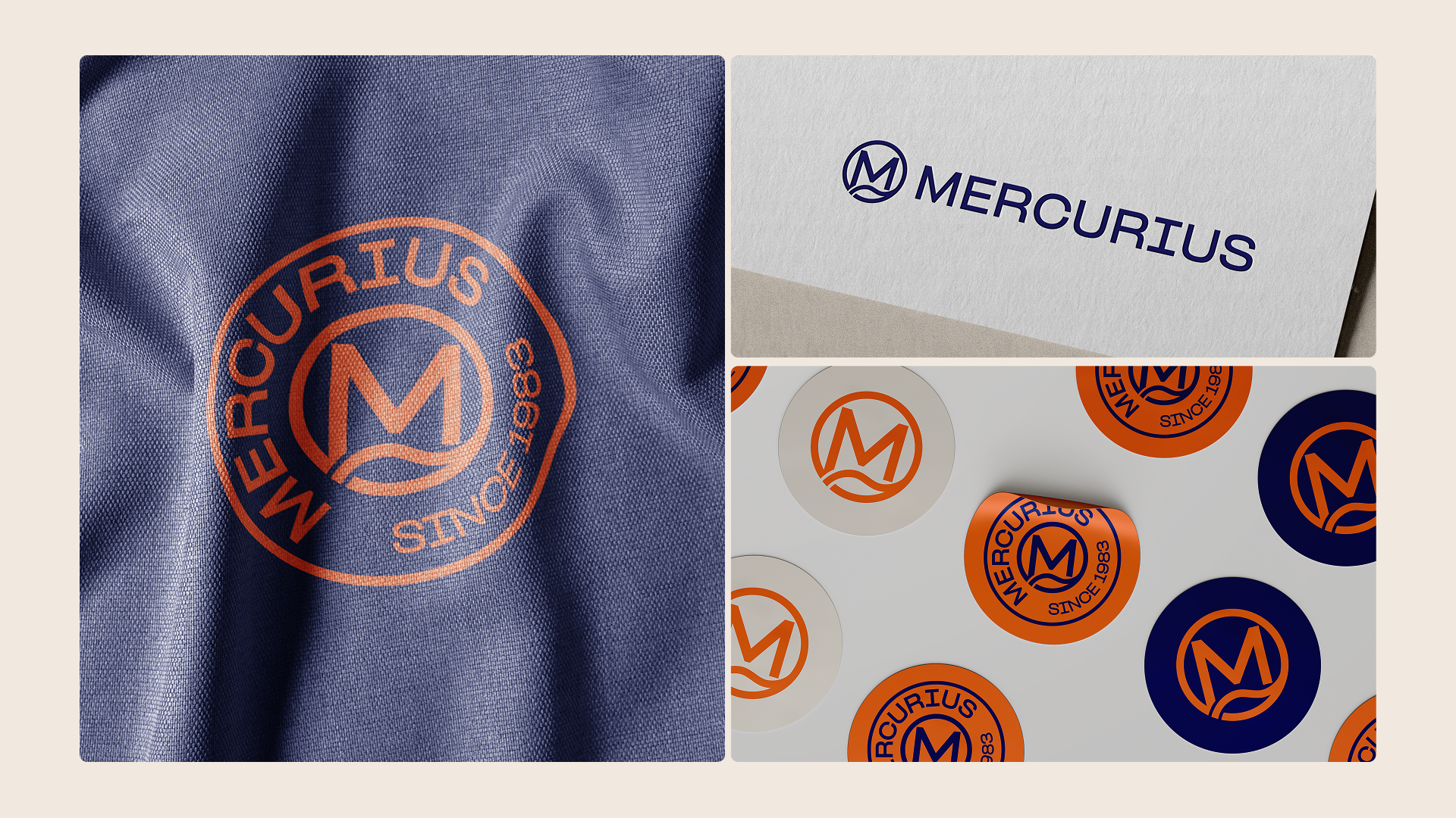
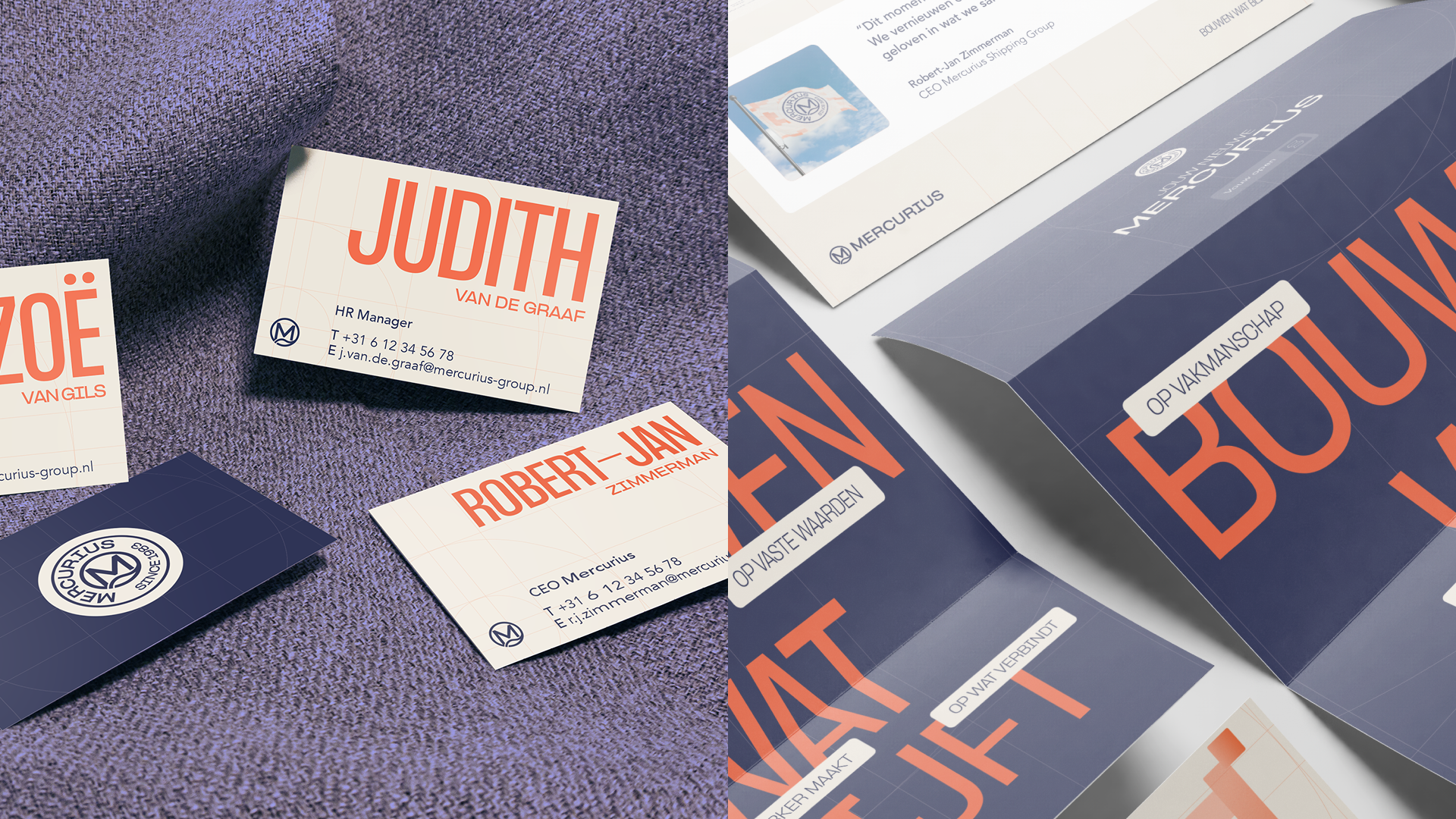
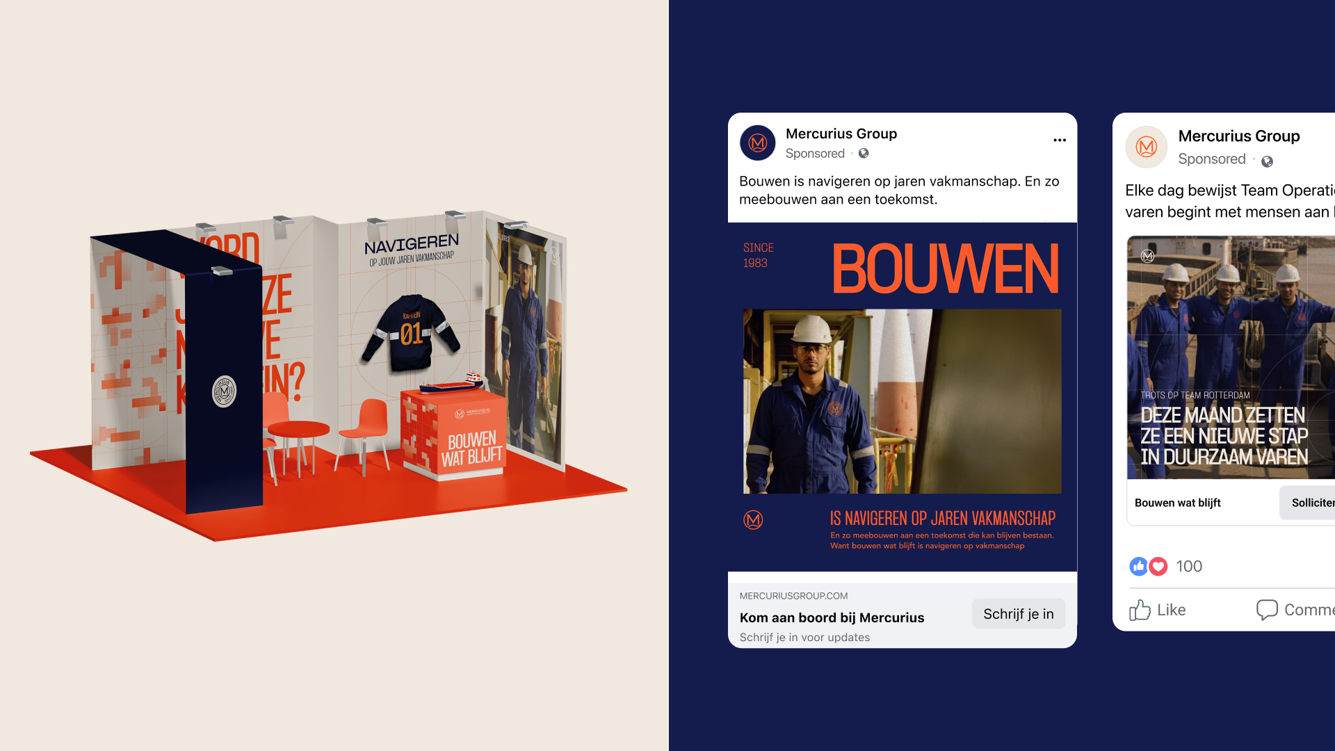
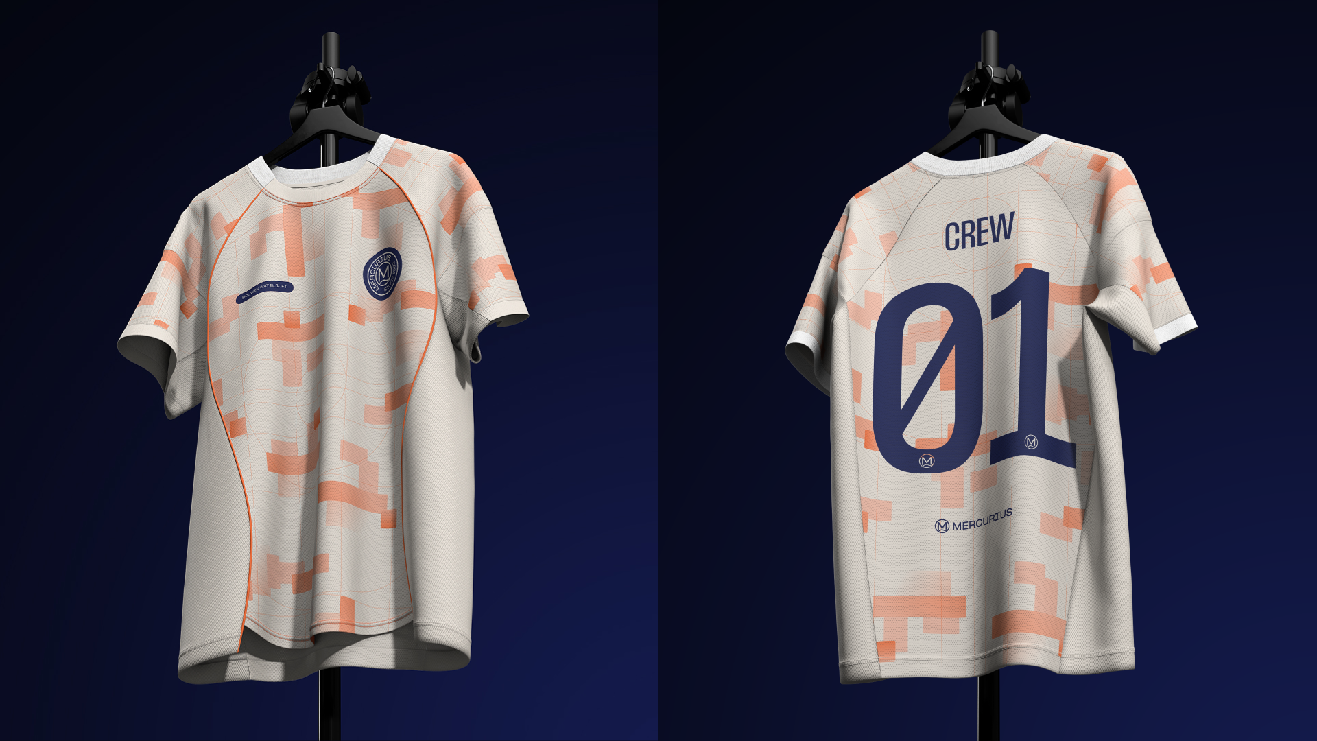
Strategy is words, but a brand lives through visuals. Once the positioning was validated, we benchmarked the new direction against the current market and competition. The goal? To spot visual opportunities and build an airtight case for change. This gave us a laser-focused scope for the brand design. We took a hard look at the practical impact: which elements do we change, and what do we leave untouched to ensure little operational disruption? Through moodboards, we set the visual bar. As soon as everyone was aligned, the real craftsmanship began. We designed the new visual identity from the ground up, moving from individual style choices to perfect synergy. Ultimately forging a consistent and future-proof brand system. Mercurius’ new visual identity blends craftsmanship with navigation. Mixing modern industrial design with maritime history. For an instant feel of raw craft, we chose the variable typography of PP Formula, inspired by the lettering on shipping crates. The palette pairs a deep Indigo Blue with a bold Exuberant Orange, injecting a heavy dose of grit and energy onto a reliable foundation. The iconic radar serves as the grid for all brand assets: the ultimate symbol of connection. The new emblem logo ties it all together with the look and feel of a sports logo, driving home that internal sense of club culture.
Launching a brand in the maritime sector requires a highly pragmatic approach. Following the design phase, we mapped out a three-stage rollout roadmap. By ruthlessly prioritizing based on target audience and business needs, we brought razor-sharp focus to the launch: what is critically needed right now, and what can follow in a later phase? Armed with this priority list, we activated the core channels. We built a brand-new website with a seamless CMS, developed ready-to-use templates for daily communication, and locked in the fleet’s color system. No fragmented deliverables, but a scalable toolkit that leaves Mercurius fully equipped for the future.
The original pain point was clear: a cutthroat shortage of crew members and low engagement caused by the physical distance between ship and shore. With this scalable brand system, Mercurius tackles that recruitment challenge at its core. Industry modesty has made way for pure magnetic appeal. On every platform, Mercurius now exudes the authority and pride that befits an absolute industry leader. Initial results from the soft launch show that this down-to-earth club culture resonates instantly. Both on the quayside and in the engine room. This new foundation sets the stage for the full rollout. Mercurius has the wind in its sails for the next phase of recruitment and growth, backed by a brand that top talent actively wants to sail for.