en

For nearly three decades, Spine & Joint Centre (SJC) has built a strong reputation in treating chronic back, pelvic, and neck pain. Their approach has always been medical-specialist, small-scale, and focused on long-term results. Yet in recent years, the centre faced turbulent times. Internal reorganizations forced staff reductions, and the future came under pressure. Communication and profiling proved to be weak spots. SJC relied mostly on word-of-mouth and internal dedication but lacked digital visibility. In a rapidly changing healthcare landscape with rising costs, stricter agreements from the Integrated Care Accord, and an aging population, relevance and distinctiveness became harder to maintain.
The board knew their vision was unique, but the story wasn’t understood. In a market flooded with generic claims like “quality” and “care tailored to the patient”, SJC risked going unnoticed. Without a clear positioning, patients, referrers, insurers, and even employees could disengage. A rebranding was essential to survive and to express their vision more powerfully.
We immersed ourselves in their context. The sector was trapped in predictable promises and visual conventions. Everyone said the same things and looked the same: clean and modern, but without distinction. Through research and stakeholder conversations, it became clear that SJC’s true strength lay elsewhere: bringing recovery back to the core. Quality and dedication had always been strong, but the language and identity failed to convey that promise.
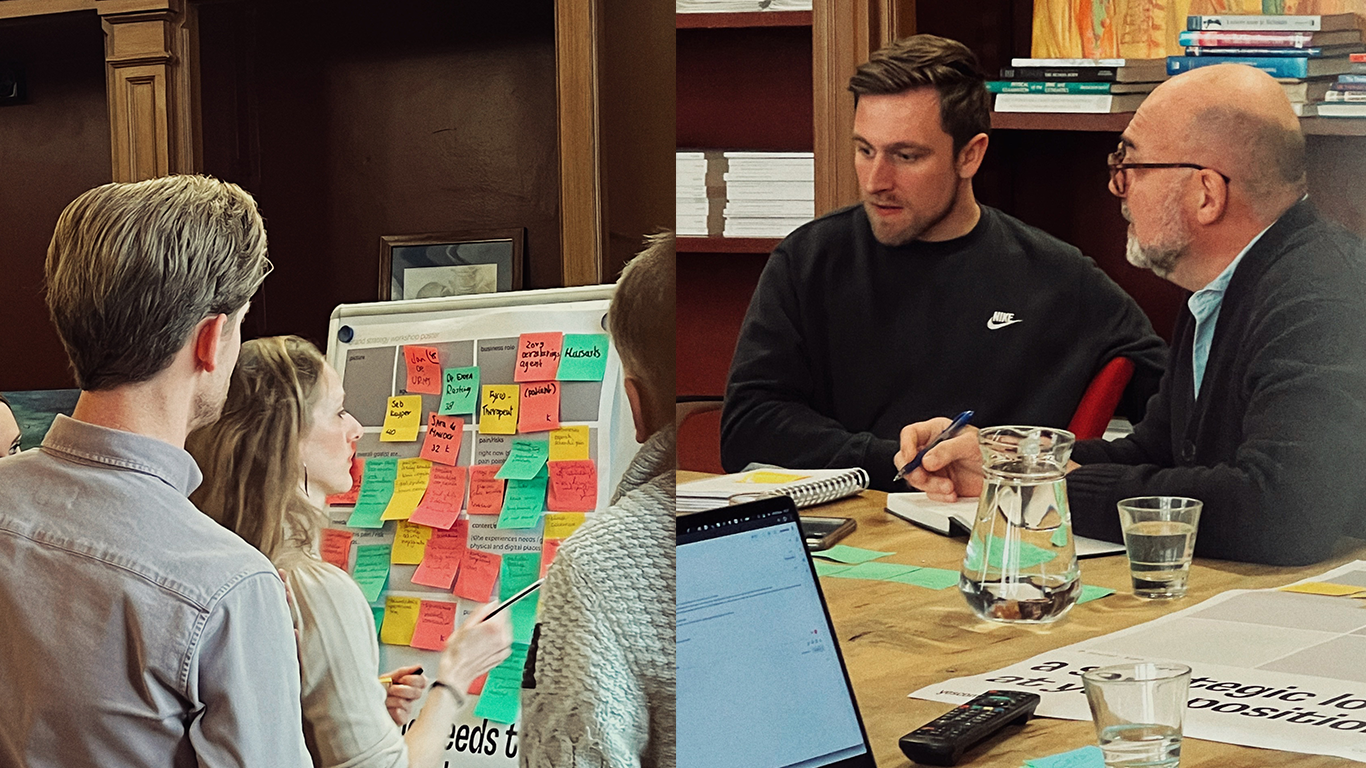
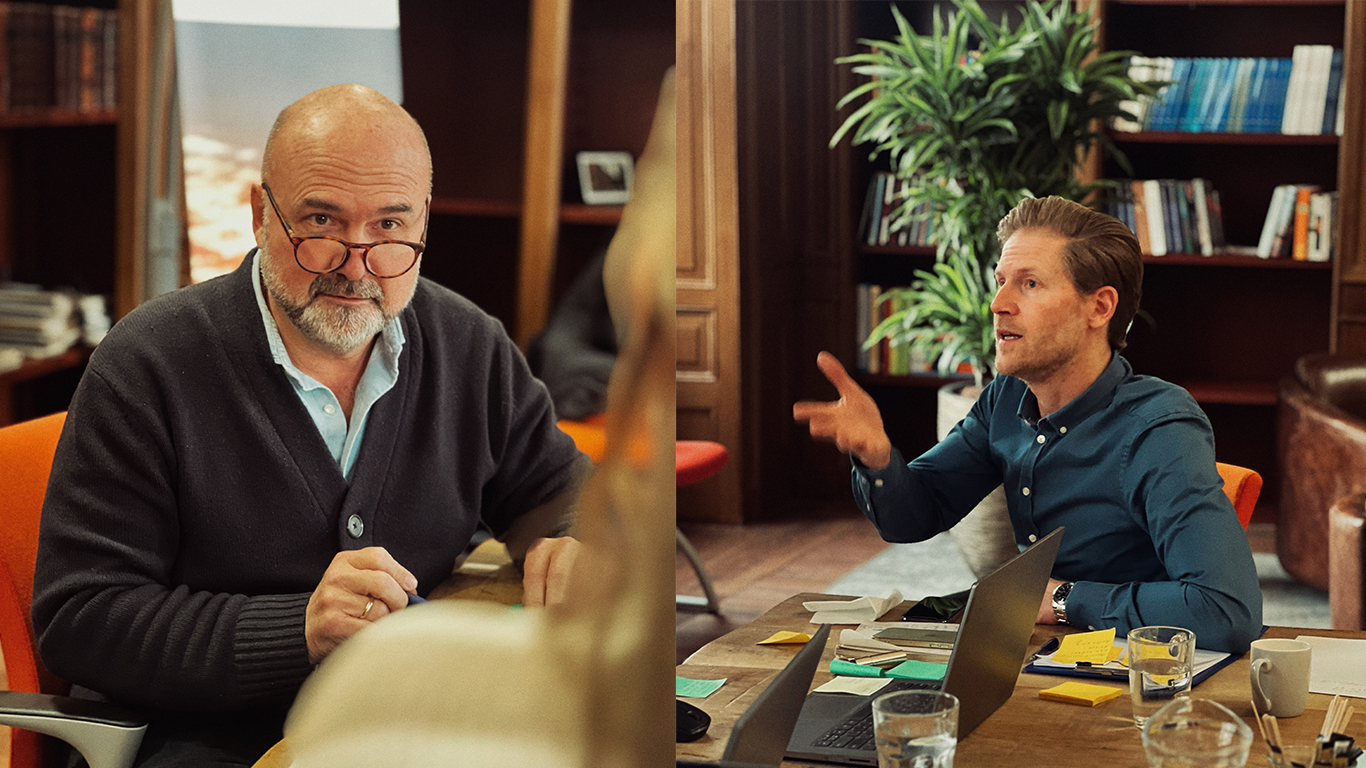
In multiple brand sessions and workshops, we distilled their essence. From long-winded descriptions and empty terms to one sharp principle: core treatment. Not treating symptoms, but addressing the cause. Not temporary relief, but lasting change. From this foundation, we developed the brand story and promise: “Move towards a core-healthy life.” With the mission to make core treatment the standard in rehabilitation within the next ten years.
Before finalizing the course, we tested the positioning with the target audience we have written it for. Their response confirmed that core treatment was credible and distinctive. This ensured buy-in and minimized risk.
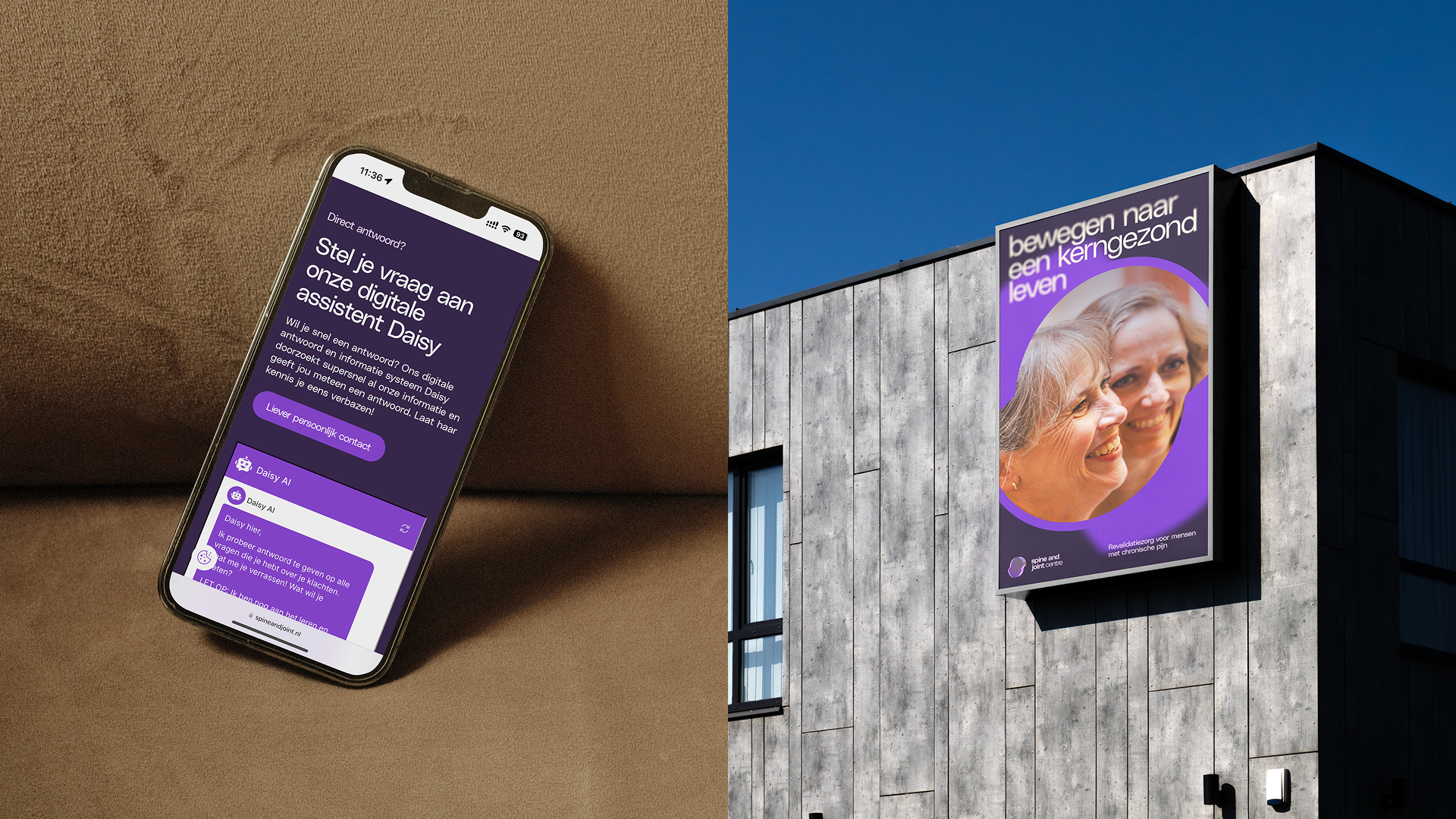
With the chosen direction Focus on the Core, we translated SJC’s vision into a visual identity that brings clarity. A logo as a lens. A visual language of blur to sharp, as if looking through a telescope. Colours and typography that balance authority with warmth. Photography that moves from diffuse to clear. This made core treatment visually tangible. Modern, human, and distinctive without falling into healthcare clichés.
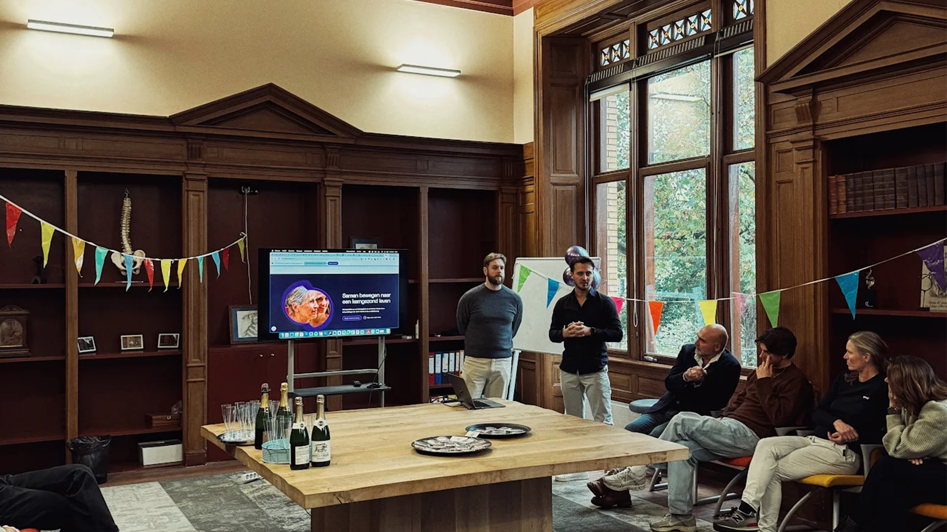
Ahead of launch, we scoped the priority channels. We developed in-house the digital pillars website, mailings, and social media. And guided the team in rolling out physical applications such as signage, uniforms, and clinic spaces. The new identity was implemented consistently, from the first digital touchpoint to the in-clinic experience.

A brand does not end at launch. We designed a structure to actively measure impact and adjust course. The long-term ambition was translated into annual goals and practical formats that break down into quarterly actions. This ensures that SJC stays true to its vision while remaining concrete in execution.
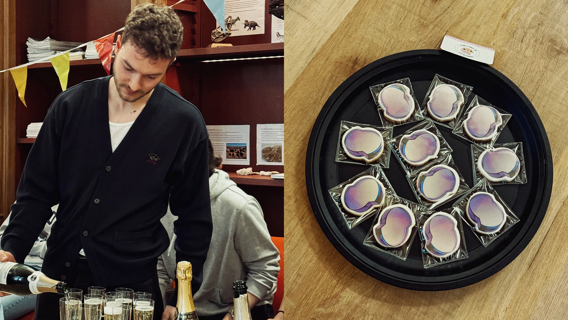
With a sharp story and a distinctive identity, Spine & Joint Centre now stands stronger than ever. For patients: a brand that inspires trust and hope. For referrers and insurers: a centre with a clear and credible position. For employees: an identity that provides pride and direction. And above all: a brand that empowers SJC to make core treatment the new standard in rehabilitation within the next ten years.