en

Capriole Coffee Service has been around since 1975. From a man with a van to an established player with 57 employees and a multi-million euro turnover. Reliable, full-service, always on time. Strong in relationships, strong in operations.But the coffee market changed rapidly. From filter coffee to oat milk cappuccinos and specialty coffee bars around the corner. Office workers became more demanding, facility managers felt the pressure of those demands, and sustainability climbed to the boardroom agenda with CSR goals. In an overcrowded market of big names, niche brands, and new cowboys, Capriole risked being seen differently: stable, but old-fashioned.
How do you keep the strength of almost fifty years of reliability while answering the needs of today’s progressive coffee drinker? How do you prevent churn among existing clients and prove you’re ready for the future of coffee? The answer was not to rebrand Capriole, but to build something new. A brand bold enough to look ahead, without losing the operational certainty of Capriole behind it.
We immersed ourselves in the coffee market. Trend analyses showed that consumers seek adventure, sustainability, and experiences. Yet most competitors claimed the same sustainability and quality story. From customer and audience research we learned: facility managers want reliability, but employees and visitors crave progressiveness. That tension revealed the space for a new brand.

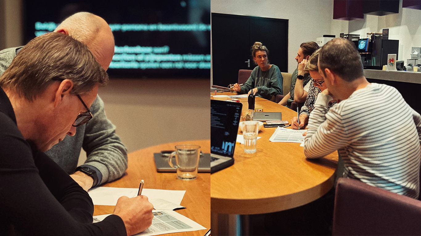
Together with leadership, sales, finance, operations, and marketing, we distilled the essence in four brand sessions. Not a sub-logo or variation, but a standalone brand. Progressive, adventurous, with its own coffee line and identity.That’s how Veya was born. Derived from via (path, way) and ea (they, them): the path of connection. A name symbolizing the journey and the people behind every cup of coffee.The promise became clear: “Sharing. Coffee. Love.”Coffee as a ritual of connection. From farmer to barista, from colleague to customer.
Before starting the brand design phase, we tested the textual brand concept with both customers and non-customers. Feedback confirmed that Veya was both credible and attractive. That way, we knew we were on the right track without risking the wrong story.
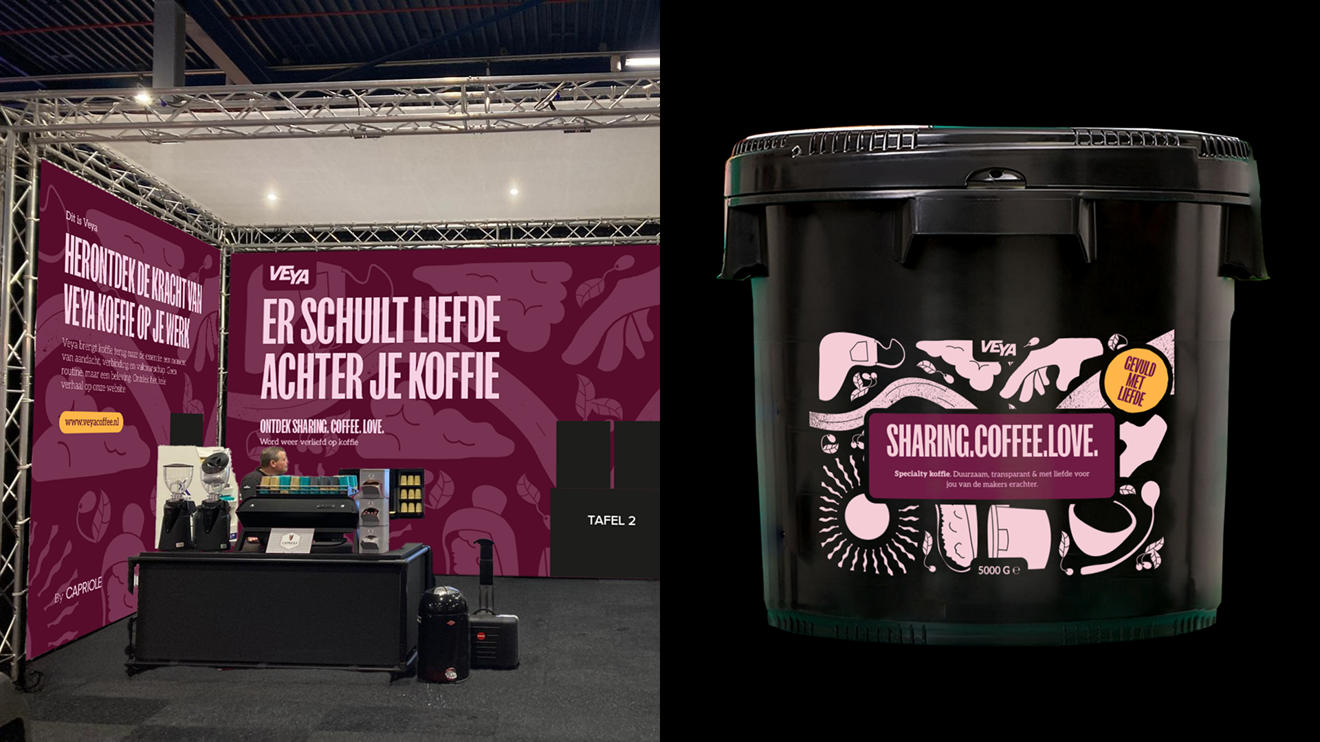
For Veya we chose the creative direction we called “Let’s go on a journey”. A visual identity where every detail tells the story of coffee: illustrations narrating the journey from bean to cup. A visual language of routes and paths returning throughout. Purple as the primary mysterious and premium color, and bold, rounded typography that adds warmth and confidence. Each coffee also received its own name, accent colour, and illustration. Bringing its origin and flavour to life. Like Sun of Ipanema (a Brazilian single origin capturing coastal warmth) and Moonlit Andes (a Colombian coffee with the mystique of the mountains). Not only the brand, but every product became a carrier of the brand promise: Sharing. Coffee. Love. Ready to come alive, like a route map you can walk yourself.
The first launch aligned with a major facility fair in Eindhoven. We finetuned the scoped perfectly for that moment: an MVP website, trade fair stand, machine screens, flyers, sample jars, and workwear. Everything revolved around one thing: experiencing Veya. And it worked. At the fair, we saw the brand come to life and watched how people reacted. Online, users could dive into each blend’s story and meet the makers behind the coffee.


Veya is more than a brand. It’s Capriole’s answer to the future of coffee. For customers: progressive, backed by Capriole’s reliability. For coffee drinkers: a brand that makes experience, sustainability, and connection tangible. And for the market: proof that an established player can still pioneer. The journey of Veya has only just begun. But one thing is certain: this brand is set to put coffee back on the map.